Westrock Design System
Westrock was undergoing a digital transformation, but the experience layer was fragmented across teams and tools. There was no cohesive design system in place, and accessibility was inconsistent. Most teams used their own design patterns, and many still relied on Sketch. The lack of standardization slowed down development, caused rework, and created inconsistent experiences across products like the Internet of Packaging (IoP) and various internal tools.
Role & Team
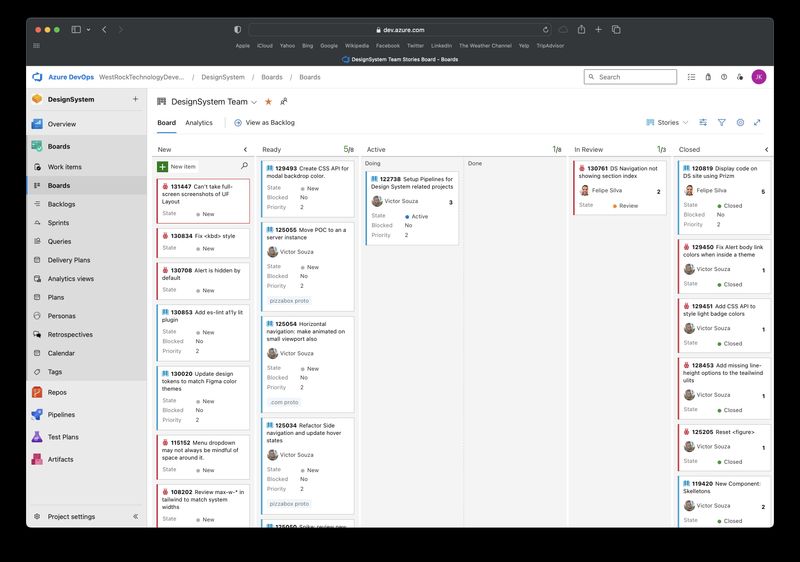
I was the sole architect and driver of the Westrock Design System. I wore multiple hats across the lifespan of the project. Serving as the design system architect, product manager, scrum master, accessibility lead, designer, and front-end contributor.
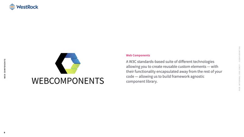
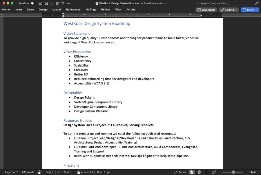
I defined the vision, created the roadmap, and established the system’s governance model, token strategy, documentation, and rollout process. I also guided the transition from Sketch to Figma and designed the cross-platform component library from the ground up.
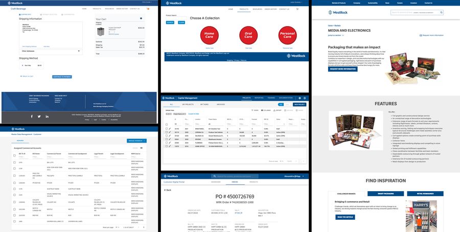
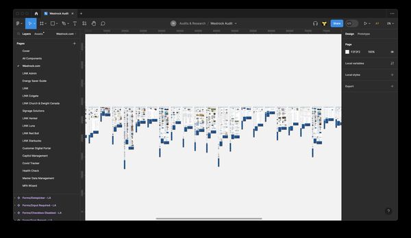
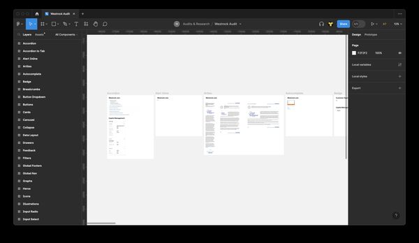
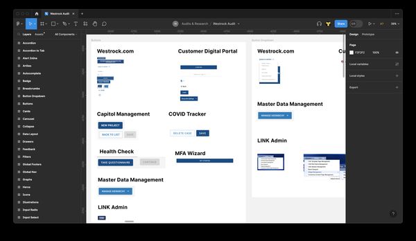
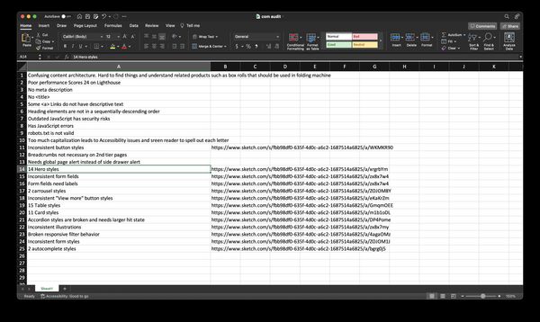
As adoption grew, I collaborated with developers, product owners, and stakeholders to validate patterns and integrate the system into products like IoP and the Admin Portal. I also held weekly office hours to support teams and conducted audits of the existing design layer to identify inconsistencies and technical debt.
Strategy
My first step was to define core goals:
- Unify design and dev workflows
- Create consistent, scalable components
- Improve accessibility across the product ecosystem
- Align the system with Westrock’s broader digital modernization
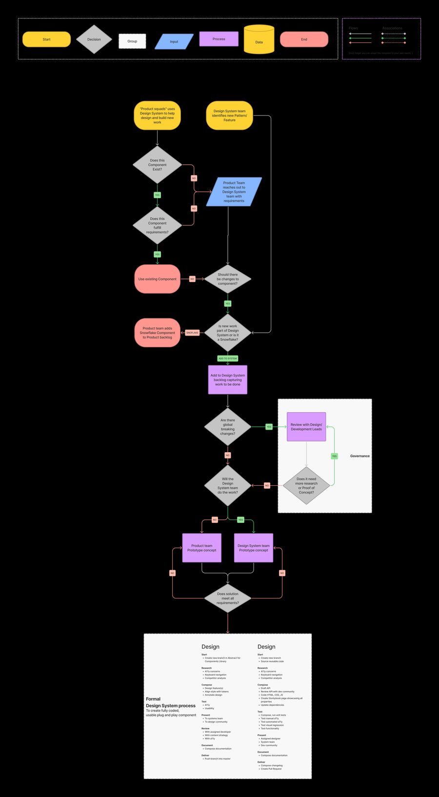
I set up a governance model with defined roles, created a roadmap that prioritized foundational tokens and components, and aligned system principles to support theming and brand consistency.
Execution
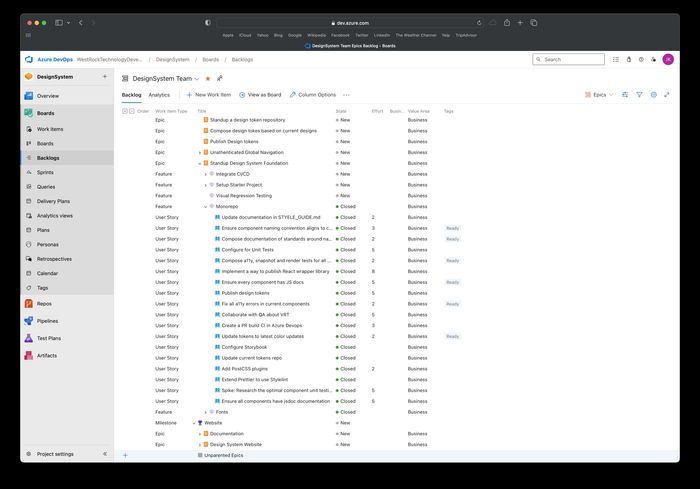
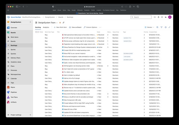
- Audited and consolidated component patterns
- Built WCAG-compliant base components with tokenized styling
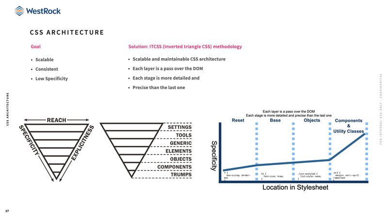
- Defined a scalable CSS architecture aligned with dev teams
- Created Sketch-to-Figma migration plan and trained teams
- Designed and documented system patterns for IoP and Admin tools
- Delivered PoCs that validated theming and token flexibility
Once the system was established and adopted across key projects, we created an internal promotional video to highlight its value and drive broader awareness across product, engineering, and business teams.
Accessibility Focus
Accessibility was embedded from the beginning. I structured color tokens around contrast requirements, added interaction specs for keyboard and screen reader use, and partnered with QA or compliance teams for review. My checklists helped guide product teams and reduced accessibility tech debt in core apps.
Outcomes
- Increased design efficiency by 35%
- Cut down rework and boosted developer velocity
- Enabled broader adoption through consistent documentation and tokens
- System patterns were reused in high-profile projects like Authentication, IoP, and the Admin Portal
- Helped product teams shift from ad hoc design to scalable, token-driven development
Evangelizing the Design System
We socialized the value through demos, office hours, and a concise stakeholder deck, building trust across engineering and product.

Governance & Contribution
A simple, transparent model enabled safe scaling: release cadence, contribution guidelines, and roles across design, engineering, and product.