Prudential Design System
Prudential's digital products lacked cohesion and efficiency across teams. Multiple teams were designing and developing in silos, often duplicating efforts and creating inconsistent user experiences. There was no shared design language, and onboarding new teams was slow due to fragmented tooling and undocumented UI patterns.
This fragmentation impacted quality, time to market, and accessibility standards across web properties. Development cycles were slowed by lack of reusable components and poor communication between design and engineering.
Role & Team
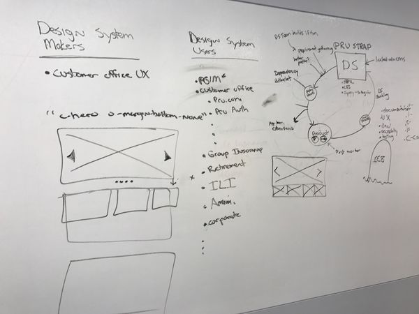
As Design System Lead, I built and led a cross-functional team of eight designers and engineers, managing both onshore and offshore contributors. I was responsible for strategy, architecture, documentation, and team leadership.
I collaborated closely with DevOps, QA, product teams, and leadership to ensure the system supported continuous delivery, enterprise-wide reuse, and accessibility compliance. I also established formal governance processes and collaborated with the Brand group, who had CMS access to make updates directly. Several developers became champions of the design system, with one joining the core team for a month to better understand how the system was built and maintained.
Strategy
My strategy centered on building a scalable and maintainable design system that could serve the entire enterprise. The initial focus included:
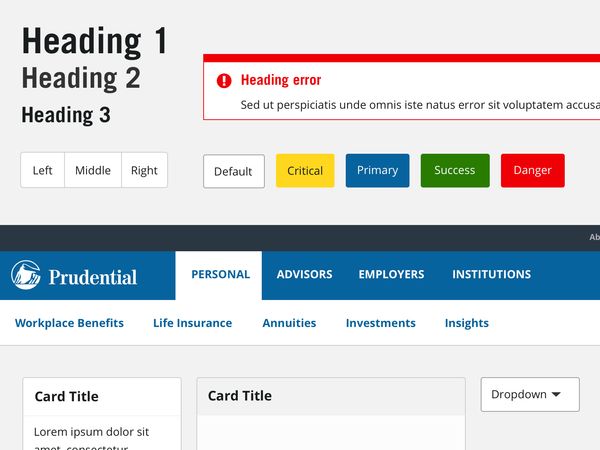
- Creating a unified design language across teams
- Building a Global Component Library for reusable UI
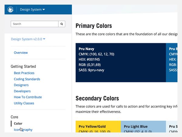
- Launching a central design system website for discovery, onboarding, and documentation
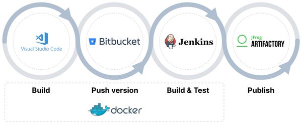
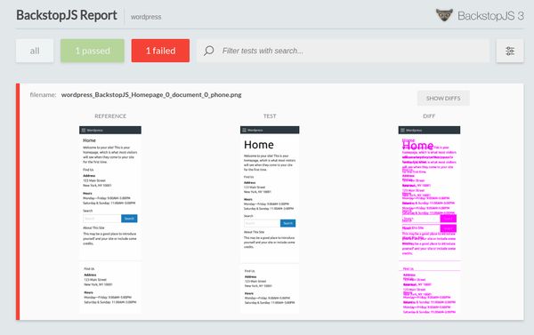
- Partnering with DevOps to integrate the system into CI/CD pipelines and enable visual regression testing
- Establishing internal education practices to improve adoption and reduce reliance on tribal knowledge
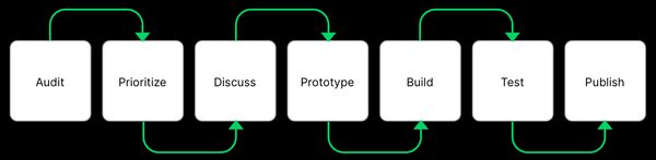
Execution
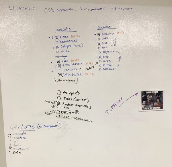
- Designed and developed an enterprise-wide scalable component library
- Integrated automated visual regression testing with CI/CD pipeline
- Created internal documentation site to support adoption and onboarding
- Built accessibility standards into design and engineering workflows
- Mentored design and development teams to support consistent usage and collaboration
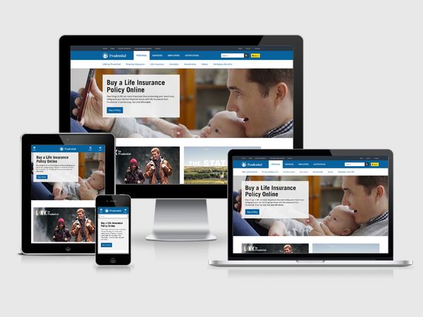
- Developed mobile-first responsive guidelines, improving usability across platforms
Accessibility
Accessibility was a non-negotiable pillar. All components were built to meet WCAG 2.0 AA standards, reducing legal risk and improving usability. I worked across design and engineering to ensure that contrast, semantic structure, and keyboard navigation were embedded from the start.

Outcomes
- Increased developer productivity by 45% through reusable components and design consistency
- Reduced product handoff time by nearly 50%
- Boosted onboarding speed and knowledge sharing by 60% via internal documentation site
- Improved product quality and reduced development costs through automation and visual regression testing
- Created a scalable foundation still in use across multiple Prudential products


Efficiency Amplified, Impact Multiplied.
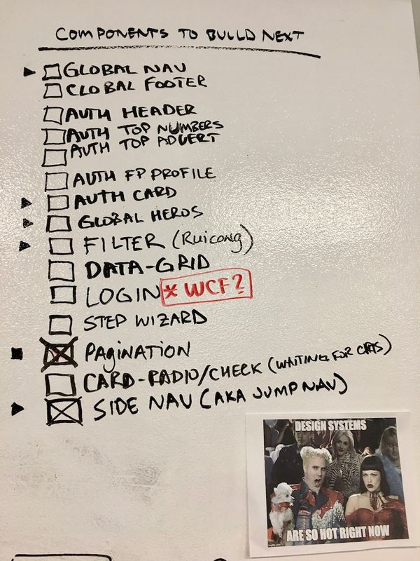
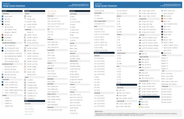
I made strategic decision and chose 17 comprehensive base design system components to develop, including an accessible color system, spacing, and font sizes using Sketch. These components formed the foundation for consistent and inclusive UI designs across our product ecosystem.
- 45% reduction in development time: Developers could leverage pre-built, tested components.
- 50% faster onboarding: New team members easily learned and implemented the design system through documentation and instructional videos.
- Enhanced documentation: Improved usability and maintainability.
- 100% WCAG 2.0 AA compliance: Ensured inclusive design for all users.
- Stronger team collaboration: Workshops and forums fostered knowledge sharing and ownership.
"Pru-Workbench" pioneering design system development pre-Storybook era
Watch as we pioneer design system development, crafting components and testing them in a pre-Storybook era.
Design System Evangelism
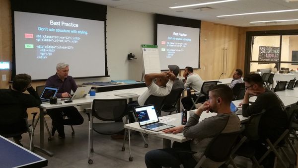
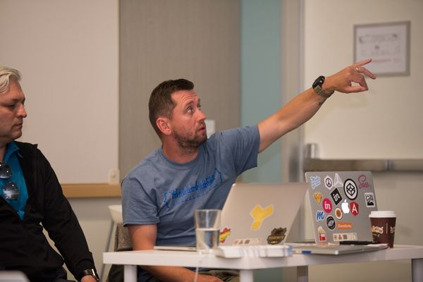
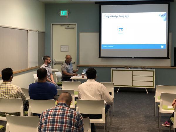
- Conducted workshops in New Jersey, California, and Ireland to promote the benefits of the design system and encourage adoption.
- Facilitated bi-weekly public forums for open communication and feedback.
- Created detailed documentation and release notes to educate users.
- Collaborated with developers to ensure seamless integration and adoption
Additional Highlights
- Integrated the design system into the CI/CD pipeline for automated testing and delivery.
- Conducted user interface audits to identify and eliminate redundancies.
- Encouraged open-source practices and contributions to the library.
A Legacy of Collaboration
This project, pioneering a solution before it had a name, solidified my passion for design systems and its power to streamline processes and create a consistent user experience. It instilled in me the importance of collaboration, user-centricity, and systematic approaches in maximizing impact, values that continue to guide my journey in this ever-evolving field.